
Product imagery
2024-25
Co-created a scalable imagery system that reflects product functionality and greets users in high traffic areas, such as homepages and landing pages.
The teamMarion Hekeler - Design Lead
Myself - Visual, Motion
Fang Shih - Visual
Mike Olasov - Motion
Drew Glapa - UX Engineer
Duration6 months
OutcomeDelivered updated product imagery for watsonx.data and documented a style guide and template for future illustrations
Our imagery lacked consistency and direction
Over the years, outdated illustrations had slowly accumulated across the product.
With new branding and a homepage refresh already underway, we saw an opportunity to modernize our in-product imagery to reflect the product's evolution toward AI-powered functionality.
Before: Ghosts of older outdated. illustrations past were still featured in high-visibility areas.
Before: We were also still using digital renderings from the marketing team everywhere.
Explorations
We built on the IBM Design Language to create a flexible style that could adapt to different use cases while maintaining visual consistency.
During our explorations, we focused on:
How can we highlight specific themes or product benefits?
How can we ensure the imagery is not competing with primary actions?
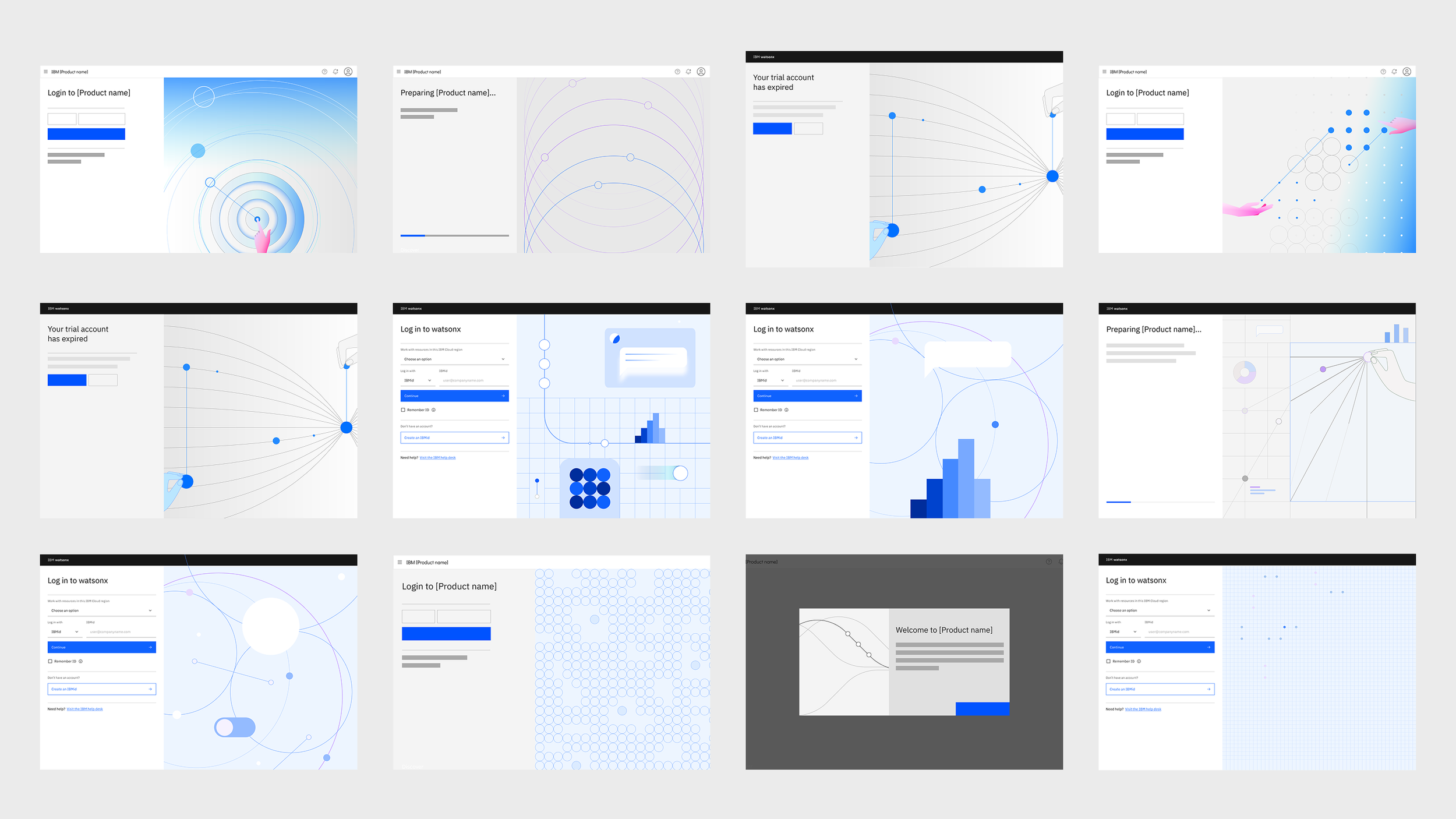
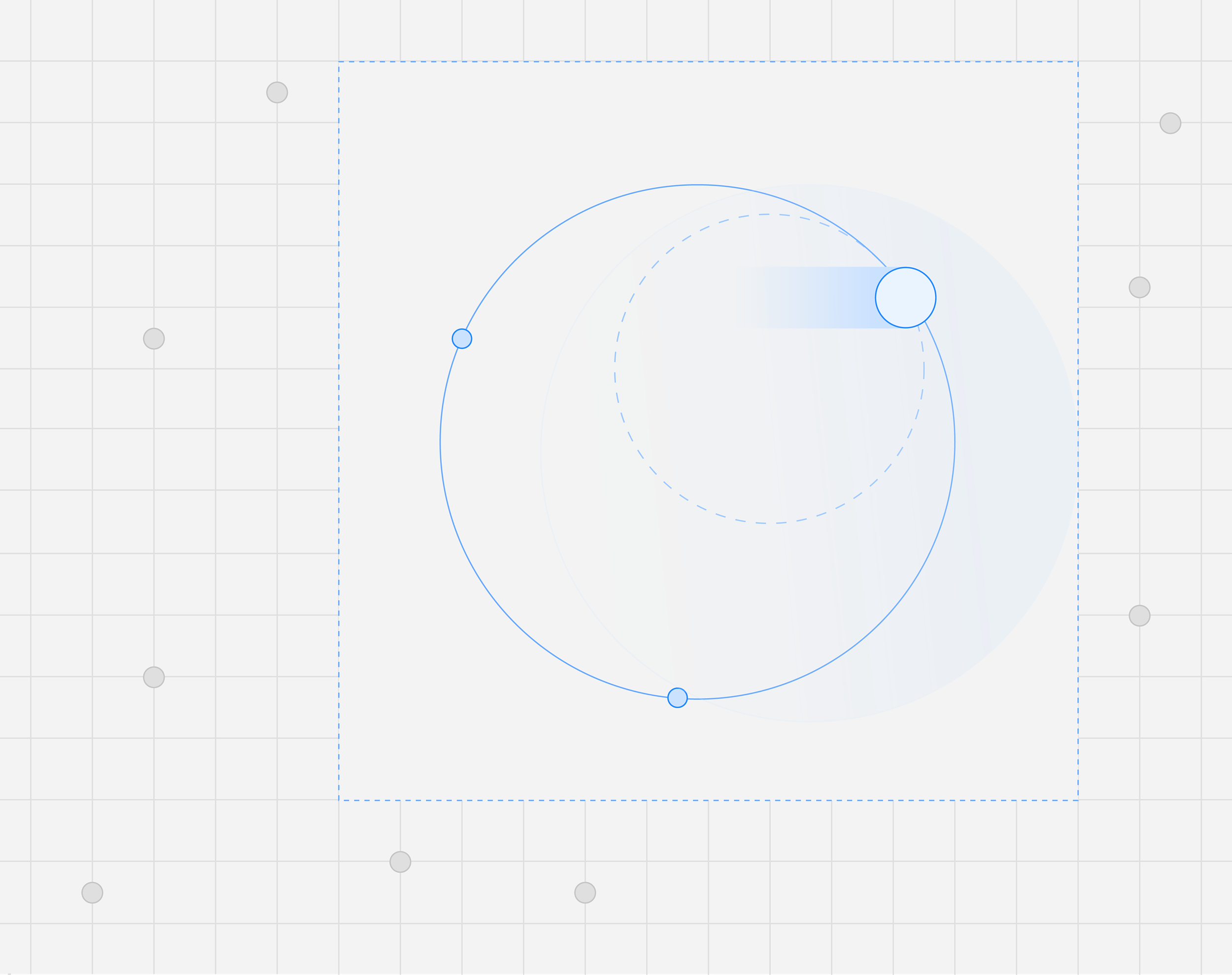
Early explorations into contrast, motifs, and incorporating hands.
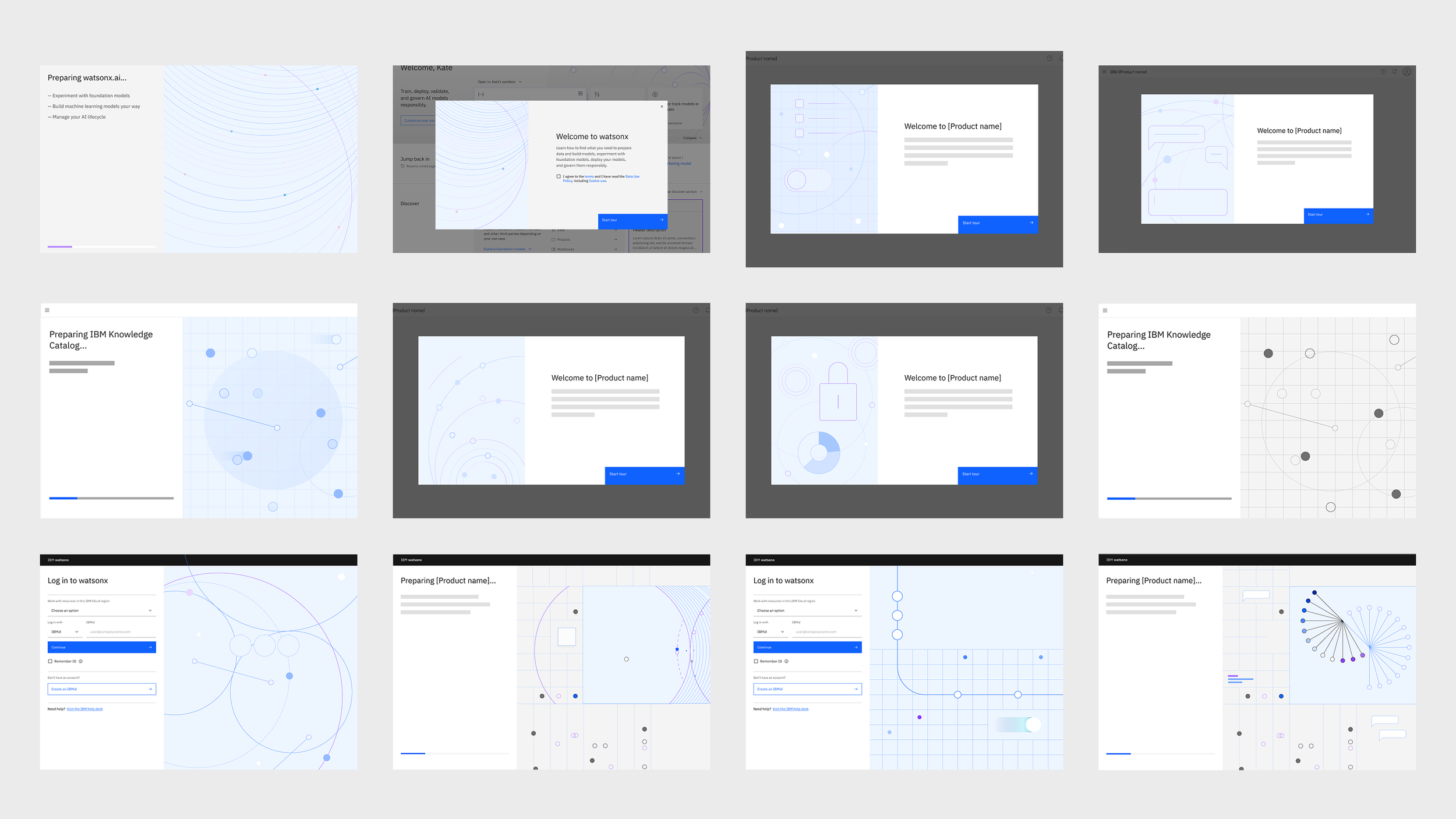
Later explorations focused on softer colors to let actions be the focal point of the page
I explored animating illustrations potentially on load or when users had to wait (such as provisioning the product)
Finalizing a system
Through rounds of exploration and feedback with branding and visual leaders, we finalized the imagery for homepages, provisioning, and welcome modals.
Our illustrations use minimal lines, soft colors, focal gradients, and subtle motion. Consistent stroke weights and repeating motifs help ensure cohesion across different use cases.


Final illustrations used for landing pages, provisioning, and welcome modals.
Product imagery in action
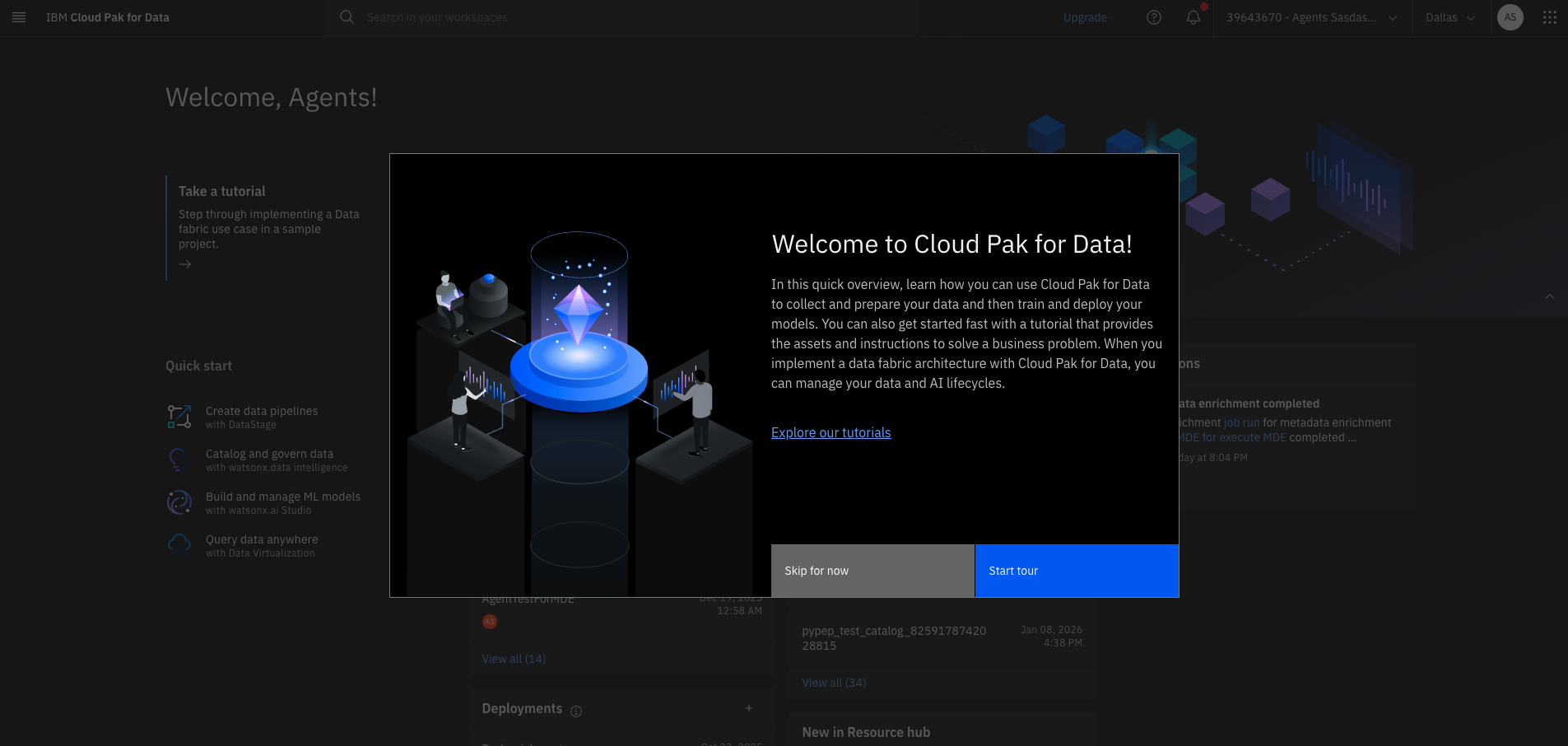
Subtle motion in the homepage header helps welcome users.
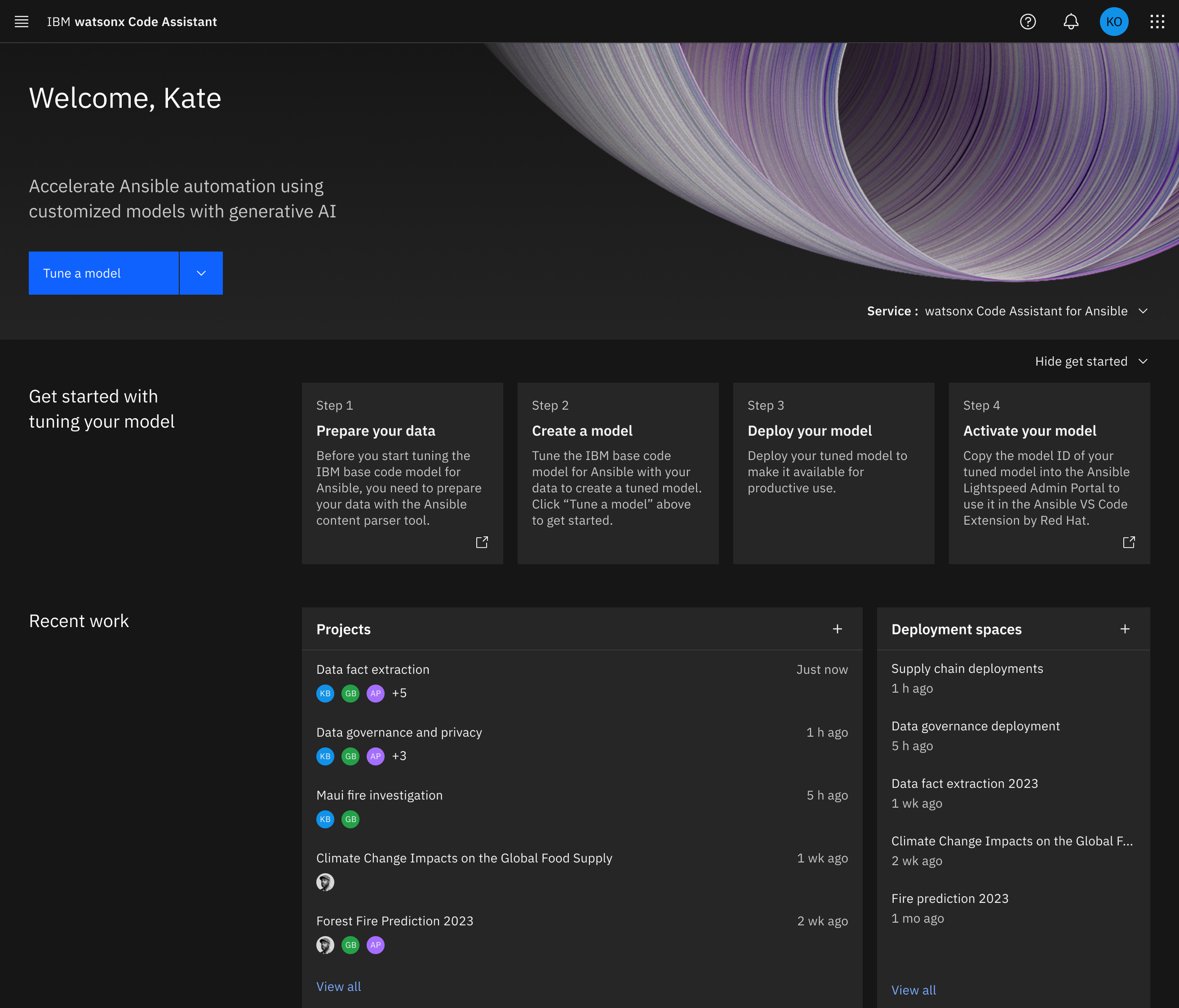
Multiple homepage iterations correspond to different product areas.
Final considerations
I would love to extend this system to other illustrations, such as empty states or success moments to truly have a cohesive visual system across our product.