
Advanced filtering
2024-25
Evolve our existing filter pattern to better suit the needs of users with large data sets
The teamMyself – UX + Visual
Emily Dowell - UX
Michael Gower - UX + Accessibility
Duration6 months (side project)
OutcomeOur pattern was added to our design system’s beta component library and is on deck for publishing 🛠️
Looking across the product
Lack of flexibility + scalability
While working on another project, my colleague and I realized our use case had outgrown the current filter pattern. We needed more flexibility and scalability
Inconsistent pattern usage
Other teams faced the same problem and had built their own solutions, creating inconsistent filtering experiences across the platform.
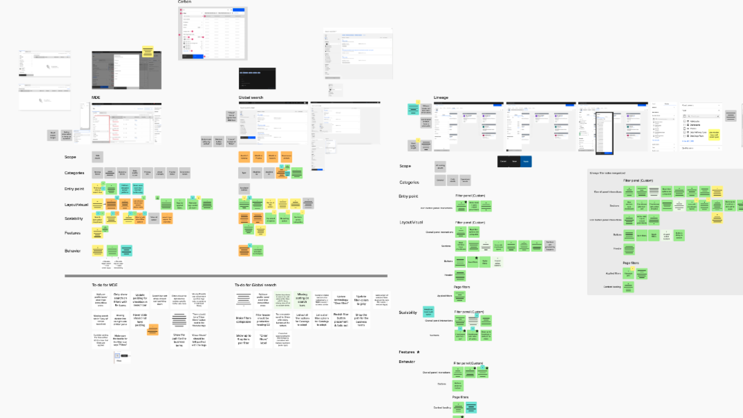
We created detailed annotations documenting behaviors, visuals, and interactions for every filtering experience. Inconsistencies were tracked as "alignment items" to guide future decisions, ensuring no detail was overlooked.
Tidying up the hierarchy
Our main challenge was ensuring scalability in every detail. When a user opens a filter panel with 20+ options, what do they see? How is it organized?
Visual hierarchy played a big role in setting up this pattern for success.
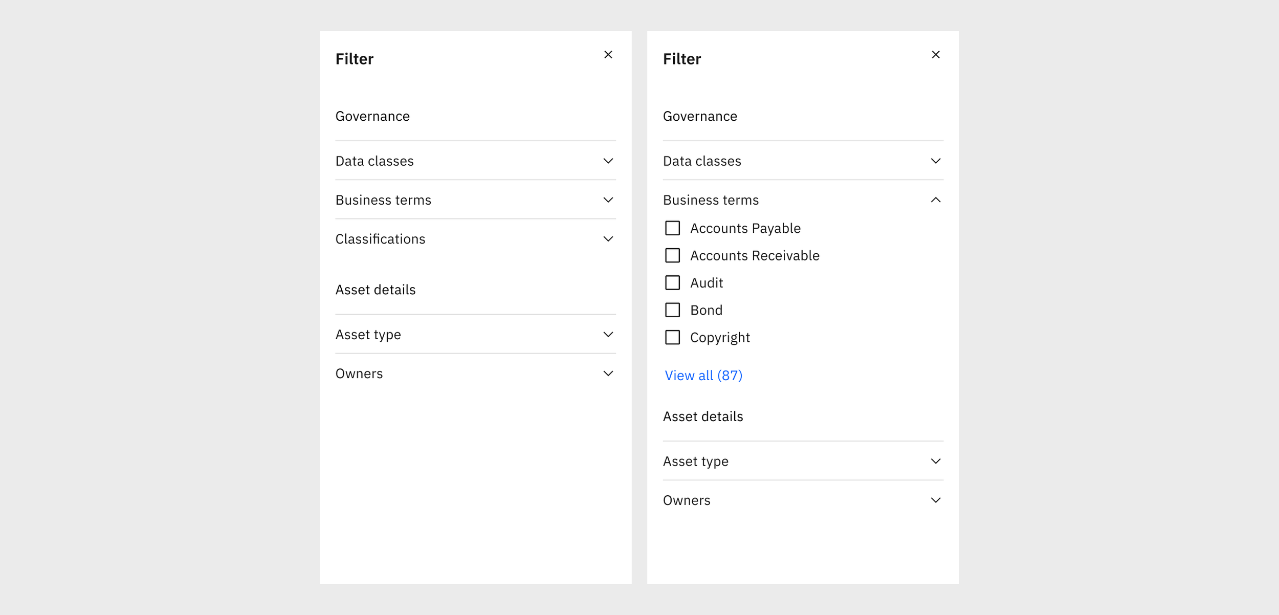
Before: Section headers didn’t provide much value and typography lacked contrast and visual hierarchy
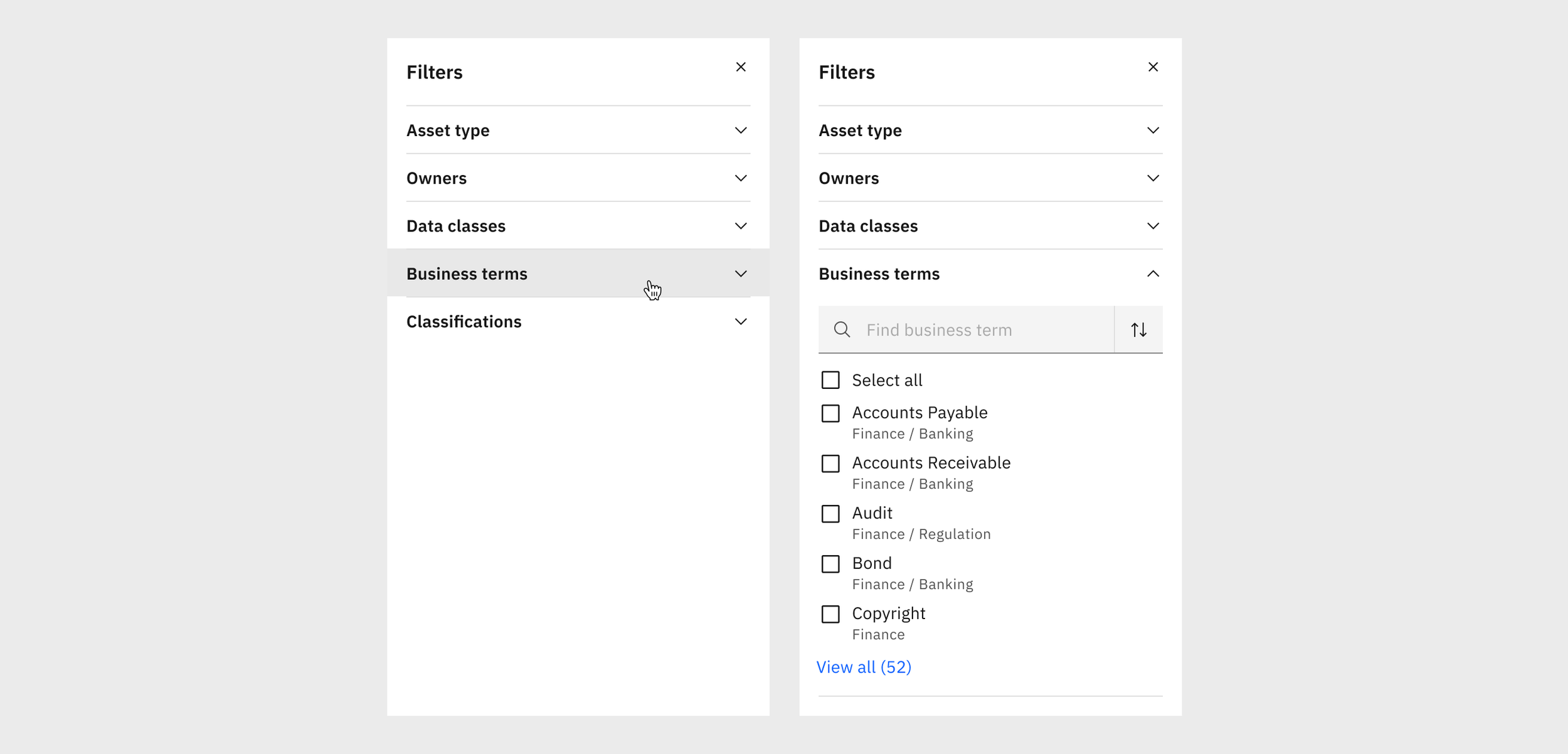
After: I cleaned up the text hierarchy with clearer categories and subheadings.
Utilizing progressive disclosure
We needed a cohesive way to show lists with 5 options, lists with 500 options, and everything in between.
We decided to tier our approach according to the number of items in the list.
This allowed greater flexibility and ensured the format best suited the scale.
For shorter lists (<10 items), we show the list in full.
For medium lists (10-20 items), we use a “show more/show less” behavior that expands and collapses within the filter panel.
For long lists (>20), we use a “view all” behavior that opens a separate shopping-cart experience. This helps reduce the cognitive load of remembering what choices they’ve selected across 20+ items.
Expanding the options
We made some much needed fit and finish improvements that allowed complete customization of the filter options to best suit their use case, including:
Icons and user images
Multi- and single-select
Second line in rows
Now users can see their filter options displayed the same as they are elsewhere in the product, with their respective icons and paths.
Advanced Filtering
The reviews are in…
“It is very interesting to see designers going through [this process] thoroughly and showing what it actually takes to make a reusable component happen.”
“This pattern is going to be an amazing asset to our team.”
Final considerations
While we got plenty of internal designer feedback along the way, with more time we would love to continue this work and do external usability studies to ensure our pattern was hitting all the marks.