
Reference Data
2020
Designing a scalable navigation system for complex hierarchical data, validated through four rounds of user research.
The team
Myself – UX + Visual Design
Kathy Alvero – User Research
Nicole Jones – Apprentice
Duration 4 months
Outcome
🚀 Shipped in IBM Cloud Pak for Data
🔴 Watson Knowledge Catalog wins 2021 Red Dot Award
🏆 Watson Knowledge Catalog wins 2021 iF Award
The problem
“Being able to transition between viewing the hierarchy and viewing the details is a big deal.”
Data stewards managing large reference data sets (think medical terminology catalogs with 70+ levels of parent-child relationships, or financial code libraries used across global departments) had no way to navigate those hierarchies intuitively. They also couldn't map alternate values across regions or add custom metadata to individual values.
The challenge: figuring out how to display deeply nested hierarchical relationships in a way that didn't collapse under its own complexity.
My role
I owned the UX and visual design end to end, working within a continuous cycle of user research and iteration. I also mentored a design apprentice throughout this project.
We ran a two-day onsite visit with one client's data governance team and nine one-hour sessions with four clients across industries, mixing open-ended discovery with usability tasks on prototypes ranging from low to high fidelity.
Iterations
Our sponsor user program gave us direct access to real clients on a weekly basis, which allowed us to rapidly test and validate our explorations.
Iteration 1: Retrofitting the existing table
My first instinct was to keep the familiar table layout and use progressive disclosure to reveal additional metadata inline, but it was quickly clear that the table couldn't carry the weight of the additional complexity.
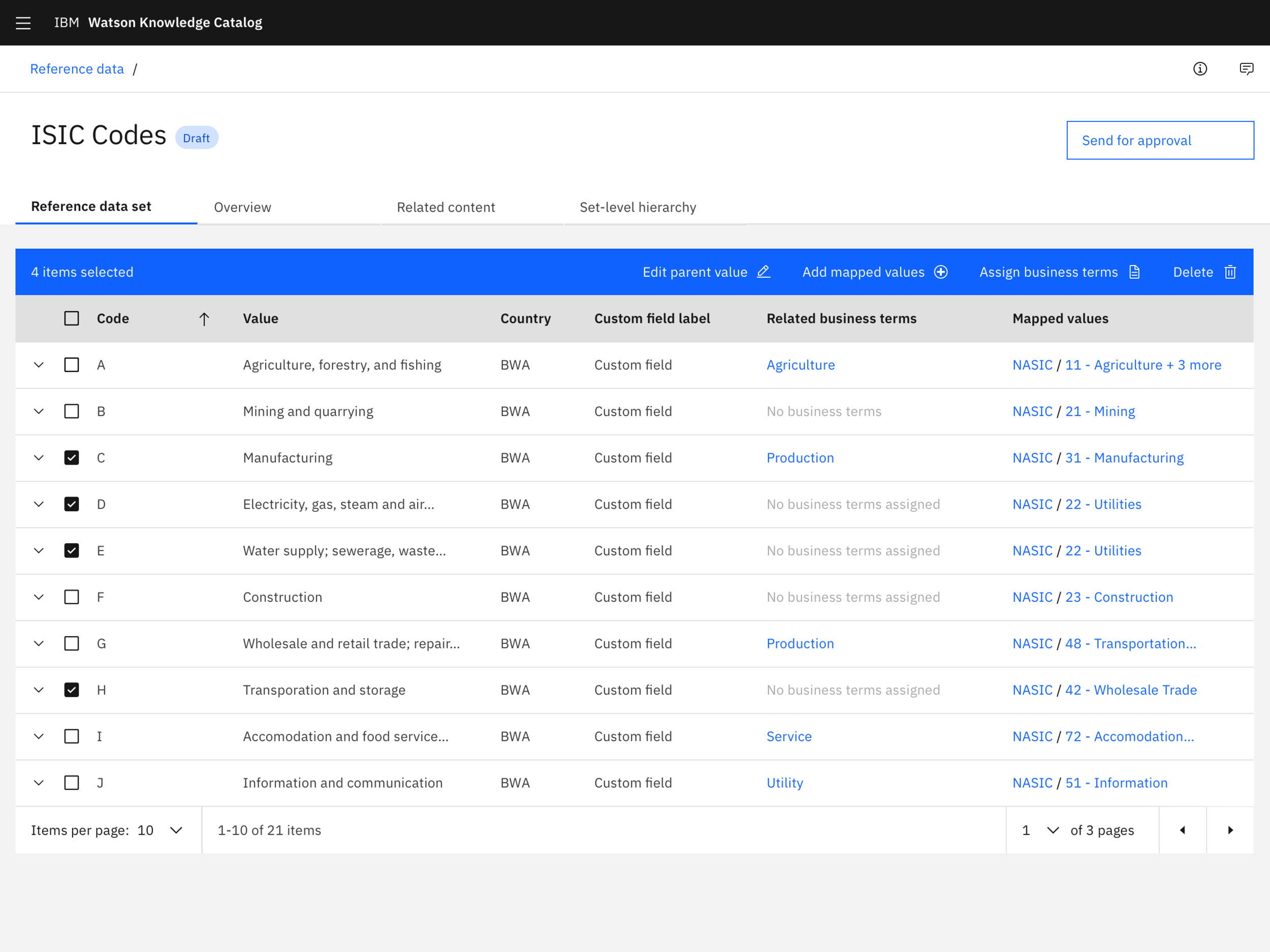
Exploration: Could the existing table support hierarchies?
“This is just overloading my brain right now”
Iteration 2: Two-panel split view
I moved code and value pairings to the left and selected value details to the right.
This fit users' mental model better to navigate on the left and inspect on the right, but depending on the industry, the need for hierarchies differed—some users didn’t have them, some only had a few levels, and some had deep levels (70+).
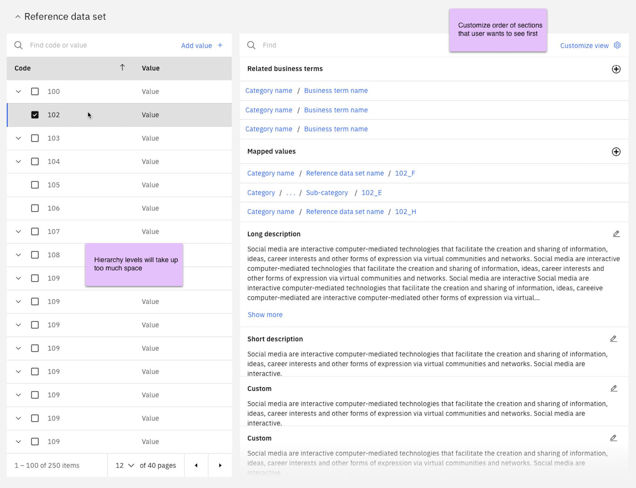
Exploration: Splitting the navigation and information
Iteration 3: Tree structure
Replacing the table with a tree structure helped condense the layout and made parent-child relationships more visible. But as users expanded deeper levels, values cascaded diagonally and left large areas of unused space.
Exploration: Using a tree to navigate
“I can traverse the levels pretty fast—this is very useful.”
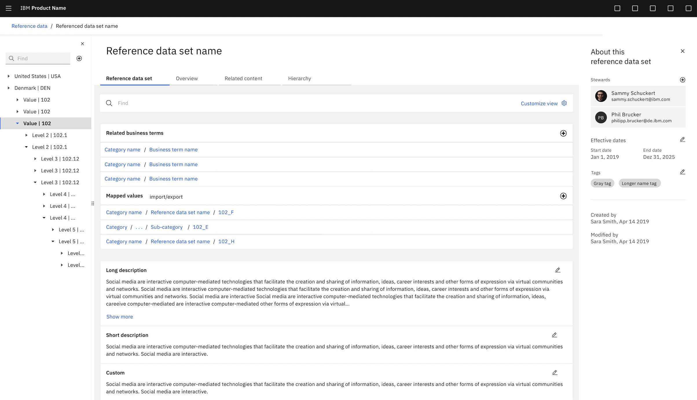
Iteration 4: Cascading panels
Separating each hierarchy level into its own panel solved the space problem. Horizontal scrolling allowed the view to scale from a flat list to infinite levels. A breadcrumb let users jump back to any level without losing context.
Exploration: Each level expands to a panel, panels horizontally scroll
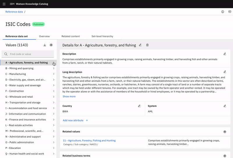
Final design
Scalable navigation
The cascading panel layout shipped as the primary navigation model, with a visible path showing parent-child relationships at every level.
Users could add related alternate values with full location paths and descriptions, and navigate hierarchies of any depth without losing their place.
Outcome
Shipped in IBM Watson Knowledge Catalog in late 2020. With this concept included, the product went on to win both the 2021 Red Dot Award and 2021 iF Design Award.
“This is a massive jump forward from the last release and I’m happy and impressed that we’ve got to this point. ”
“This clearly gives you the flexibility to come in and fill the values you’re going to make changes around. I actually think this is better than what we have today.”
Final considerations
The work I did for this release challenged me to make big decisions and defend them to stakeholders.
Changing the entire layout and functionality of a page was a hard sell to our developers and product managers, but by incorporating strong, supportive user feedback into my pitch, I was able to successfully get buy-in on what I felt would be the best experience for our users.